Pages

Thursday, February 27, 2014

Google Hates Your Mobile Website (Here's How to Fix It)


twitter_logoYou have a mobile optimized site. Woo hoo! That means you probably recognize that 67% of mobile users who land on a mobile optimized site are more likely to convert than if the page wasn’t mobile optimized, and that 61% of mobile users are likely to move onto a competitor’s site if the page they landed on isn’t mobile optimized

Having a mobile optimized site means viewers from a smartphone are automatically redirected to a URL that looks something like m.MySite.com. The “m-dot” before the URL means this is a separate version of your site that’s been built to look good on a smart phone. It’s separate from your regular desktop website, and requires you to make edits to your mobile version every time you edit your desktop version. If you want your site to adjust to other devices, like a tablet, you’ll have to develop a separate “t-dot” mobile site (it looks like this: t.MySite.com.)
Sound fine, right? Well, another way to optimize your site for mobile is by using responsive design. Responsive design doesn’t require a separate m-dot site -- just one of the reasons it's so great. Instead, mobile devices access the same URL (www.mysite.com) and the site automatically adjusts its content and layout to whatever device is pointing at it. That means you only have to maintain one website, and it looks good on every device.
There’s been some debate in the past about which type of mobile optimization is better: a separate mobile site, or a responsively designed site. However, regardless of the chatter in the blogosphere, the ultimate commander-in-chief of the internet, Google, has recently made their stance on mobile optimization clear. Google prefers responsive design to a separate mobile site.
In fact, Google has a laundry list of problems with your separate mobile website. Eek. Below are four of the biggest reasons Google hates certain mobile-optimized sites, and why they’d really rather marketers just went responsive already!

1) It doesn’t look good on every device. 

Chances are, your users probably aren’t only accessing your site from a smart phone. They might be using an iPad, a Kindle, or even older devices such as a Blackberry. Not to mention one of the many new devices that are popping up everywhere you turn.
Now there’s the iPad Mini, which is closer to the size of a phone than a regular iPad. There are Android smart phones that are getting almost as big as tablets, veering away from the original concept of “mobile” on a device like the iPhone. Heck, there’s even Google Glass, which might seem a bit advanced for today’s mobile user, but are a clear glimpse into what the future holds. (I personally use my Google Glass everyday ... and to answer your next question, it is WICKED cool.) With every new device that emerges, you want to make sure that you’re future-proofing your website to provide an optimal user experience, regardless of what device is accessing your content.
As new devices of various sizes emerge, you’ll want to make sure you’re keeping up and creating separate domains for each new screen size. More than that, every time you create a new sub page you’ll need to make sure you create an m-dot version of it, and that you correctly add and redirect that m-dot link onto your mobile optimized site. Whether you have full control of your CMS and your mobile optimized site or you have your IT team or an outside agency making edits, you’ll need to make sure that all desktop and mobile versions of your site are being updated as you add, delete, and edit existing content.
One way to overcome this hurdle is by choosing a CMS with “responsive design” instead of simply a “mobile optimized” site. Responsive design means that you only have one single domain, ”www.MyWebSite.com,” and when you edit it once, it updates and adjusts to appear optimally on every device. 
Google officially recommends responsive design over mobile optimization because it makes a better experience for your user, no matter what device they’re using. More than that, Google now only has to crawl one URL in order to rank your content. Using multiple mobile URLs is not only a pain for you, but for Google, too. Which leads me to the next reason Google hates your mobile optimized site ...

2) It spreads out your SEO ranking. 

Because Google is crawling multiple domains for each device, it’s ranking your inbound links and authority in multiple places. That means you’re maintaining SEO value across multiple domains, which spreads out the SEO links and authority you’re trying to optimize for.
As marketers, we should be constantly aware of how our web presence is working to attract new, qualified visitors to our websites. If we’re ranking for certain keywords across two domains, we’re spreading out the work we’re doing to acquire search ranking authority. This makes our efforts half as effective as they should be.
Do you really want to be doing double the work (maintaining a desktop and mobile site) to only see half of the results? If you use responsive design to maintain your content’s SEO on one domain, then your pages will rank higher since all of your SEO juice lives in one place.
This is another reason why Google prefers responsive design in search results. One website domain that is accessed across every device means Google only has to crawl one domain. One domain also means the search ranking authority Google gives your site is accurate. Regardless of how it appears on a given device, if a viewer finds your content to be helpful and relevant on a desktop, chances are they find the same content relevant on mobile too.
Giving search ranking authority to one domain across multiple devices means Google is registering the viewers who contribute to your web relevancy as individual viewers on multiple devices, not as a viewer on a mobile phone and a separate viewer on a desktop. 

3) It makes sharing difficult.

The role of “shareability” in SEO is nothing new. You want to create highly valuable content for your readers with the hope that they’ll share it with their respective networks. This increases both your reach and your authority on the web.
The problem with mobile optimized sites (and sites that aren’t optimized for different devices at all) is that they take into account the device from which a site was shared, not necessarily the device that is consuming it. Sure, I can view an article on my smart phone, find it useful, and post it to Twitter. The problem is, when my social networks open up that link on their desktop, the m-dot mobile version of the site will load.
mobiletodesktop
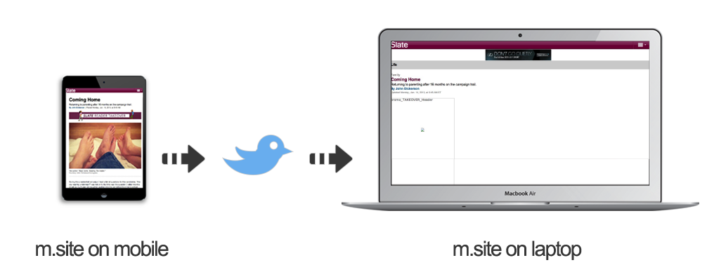
This makes for a less-than-optimal user experience, and decreases the likelihood of your content getting consumed, let alone shared. We’ve become a nation of “device jumpers.”
Research from Google shows that 90% of people start a task on one device, and pick it up on another (most commonly, start on a smart phone and complete it on a desktop). I do this sort of device jumping every day. I read news alerts on my iPhone in the morning. I share them to Twitter and email to myself for later research during my train ride. I read blogs on my desktop at work. I look up recipes on my iPad during dinner. I slip on my Google Glass for a nighttime lullaby from a Justin Timberlake YouTube video before bed. I’m your average digital-device jumper. Okay, maybe not average based on that last one. But you get the picture.
The rapid growth of digital, mobile devices has shown us that just because the desktop is the where the web was born, doesn’t mean it’s the only place it’s going to live.

4) It redirects users to irrelevant pages.

I touched on this one earlier, but there are a few reasons that pointing to multiple domains is a problem for Google. Of course, there is the fact that Google has to do their crawl-work more than once. More than that, hosting your content on multiple domains invites itself to a web of redirect links that will drive a user crazy.
Let me explain. When a user accesses your website on a mobile device, they must be redirected to the m-dot or mobile optimized version of your site. Many people that maintain both a desktop and mobile optimized site don’t follow Google’s best practices for mobile site redirects:
Often, a mobile user may find a certain page of yours through Google (this may be a blog post, landing page, or any individual page of your website). When it loads on their mobile device, it will redirect to the m-dot version of the page. The problem is, not every page on your site may have a mobile version created for it. That means a user will see one of a few things depending on how sophisticated your redirects are. They may be returned a 404 error page, the mobile optimized version of your homepage (not the original page they requested), or the desktop-optimized version of your site. Google prefers you return the desktop-optimized version of the page the user originally requested, since this is a much better experience than being redirected to a mobile version of an irrelevant page.
Many sites, however, neglect to do this. It requires very clear documentation and organization on the side of the webmaster in order to keep track of which pages are redirecting where, and which pages have mobile optimized versions accounted for them. Google penalizes for these types of faulty redirects that leave users in an endless loop searching for the content they originally selected to view on their mobile device.
For this reason, Google prefers responsively designed websites that only access one URL across all devices, never requiring redirects or dead ends from a mobile device.

Wednesday, February 26, 2014

Mobile Mania – The Growing Importance of Mobile Website Optimization

There’s no question that mobile devices have become a staple in everyday living around the world. Now more than ever it’s important that websites be optimized for mobile devices. Mobile optimization can increase sales, generate more traffic, and boost customer engagement. It’ll give you an edge over the competition, too.

Mobile Mania - The Growing Importance of Mobile Website Optimization

Facts and Stats to Tweet:

  • In August 2011 mobile browsing represented 7.1% of all worldwide browsing activity. »tweet«
  • Between 2/2009 and 8/2011, mobile browser share grew by 1000%. »tweet«
  • 25% (1 in 4) of mobile users expect to access the web from their device at least once a day. »tweet«
  • For online-only retailers, a mobile site can increase consumer engagement by as much as 85%. »tweet«
  • Website visitors are 51% more likely to do business with an online retailer if it has a mobile site. »tweet«
  • Mobile users are 88% more likely to do business with Auto Dealers if the website is optimized for mobile. »tweet«
  • In 2010 it was estimated that only 22% of the Alexa top 500 websites have optimized for mobile. »tweet«

Tuesday, February 25, 2014

How Important Is a Mobile-Optimized Site for Your Business?

The amount of time and money people are spending on mobile devices is growing rapidly and yet many businesses don't have a website optimized for mobile — at what cost?
First, the numbers. Mobile traffic currently makes up 10% of global Internet traffic, as shown in the chart below, and next year more people will use mobile phones than PCs to get online, according to Gartner. Purchases made on mobile devicesamounted to $6.7 billion in the U.S. last year, or about 8% of total online sales, and are expected to nearly double to $11.6 billion this year. By 2015, U.S. mobile sales are forecast to reach $31 billion.
Yet many businesses have not yet optimized their websites for mobile, frustrating visitors with tricky navigation and slow loading times. Jesse Haines, group marketing manager for GoogleMobile Ads, told Mashable that a survey of major advertisers in early 2011 showed only 21% had launched a mobile-friendly site. A 2012 L2 study of the top 100 fashion, beauty, retail, hospitality, and watch and jewelry brands found that only two-thirds had mobile-optimized sites, and yet a third of those did not allow consumers to shop from their sites.
If you're in the business of ecommerce, those figures should help you benchmark what you're already losing in dollars, but a recent survey from Google underlines the damage you might also be doing to your brand by not having your site optimized for mobile.
The survey, which tallied responses from 1,088 U.S. adult smartphone owners, found that:
  • Mobile sites lead to mobile purchases. This is a no-brainer: Shoppers are more likely to buy a product or service if your site is optimized for mobile. Three-fourths said they are more likely to return to a site in the future if the experience on mobile is good.
  • If your site isn't optimized for mobile, shoppers will go elsewhere. The majority of participants in the survey said that if they can't find what they're looking for on your site, they'll sooner seek out a competitor's mobile-friendly site instead of switching to a PC to revisit yours.
  • A bad mobile experience can damage a company's brand. A bad mobile experience can create bad feelings about your company. Nearly half of participants in the survey said they feel frustrated and annoyed when they happen across a site that's not mobile-friendly, and that it makes them feel like a company doesn't care about their business. More than half said a poor mobile experience makes them less likely to engage with a company in the future.
See More: 
http://mashable.com/2012/10/10/mobile-site-small-business/

Monday, February 24, 2014

The increasing importance of a mobile-optimized experience

We're squarely in a multi-screen world and people are using smartphones to search, shop and get things done more often than ever. That means delivering a great experience on mobile devices is increasingly important, since it affects organic visibility, Quality Score, ad position and cost, sales, and customer loyalty.

The mobile experience matters
Recent research conducted with Nielsen shows that 48% of mobile consumers start their purchase journey with paid and organic search results. With mobile ads, the quality of your mobile landing page experience directly affects how your ad ranks (including whether it's seen at all) and what you'll pay per click. Mobile site experience factors can also directly affect your organic search rankings.

Getting more mobile traffic and lower CPCs is great. But after the click, your mobile landing page experience is even more important for converting visits into sales and building customer loyalty. According to 2012 research on what users want most from mobile sites, 67% of consumers say that a mobile friendly site makes them more likely to buy, and 74% say they're more likely to return to that site in the future.

The experience of ProFlowers, a major US-based fresh flower retailer, confirms the benefits of offering a great experience on smaller screens. After launching its mobile-optimized site, Proflowers saw its conversion rate increase by 20-30%. It has also seen mobile contributing more to conversions that occur on other devices.
“Many users check us out on mobile, and then convert on our [traditional desktop] site... Regardless of where the final sale comes from, staying ahead in mobile is an invaluable part of our successful marketing and customer relationship strategies.”
- Leif Heikkila, senior director of online marketing, ProFlowers
Resources for making your site more mobile-friendly 
We think every business can succeed at providing a great mobile experience. Here are some resources to help:

Friday, February 21, 2014

Building Smartphone-Optimized Websites

Introduction

With increasing smartphone usage, making a website that is friendly to smartphone users has now become a critical part of website management. This document outlines Google's recommendations to webmasters who wish to serve content in optimized formats for both desktop and smartphone users, and notes the common mistakes you want to avoid. We have pages about websites for tablets and feature phones too.

Overview of Google's recommendations

Google supports three different configurations for creating smartphone-optimized websites:
  • Responsive design: serves the same HTML for one URL and uses CSS media queries to determine how the content is rendered on the client side. This removes the possible glitches of user-agent detection and frees users from redirects. This is Google's recommended configuration.
  • Dynamic serving: serves different HTML for one URL depending on the user-agent. Use the Vary HTTP header to indicate you're doing this.
  • Separate mobile site: redirects users to a different URL depending on the user-agent. Use bidirectional link annotations to indicate the relationship between the two URLs for search engines.
Make sure you aren't blocking resources like JavaScrpt and CSS for search engines, regardless of which configuration you're choosing. For how-to on the technical implementation, visit our details page.

Types of mobile devices

  1. Smartphones: Phones with browsers that are capable of rendering normal desktop pages, at least to some extent. This category includes recent mobile browsers that can render HTML5, and covers a diversity of devices, such as Android-based phones and iPhones.
  2. Feature phones: Phones with browsers without the capability to render normal desktop webpages. This includes browsers for cHTML (iMode), WML, WAP, and the like.
We do not consider tablets as mobile devices because, among other reasons, they tend to have larger screens. Most tablet users expect to see tablet- or desktop-optimized pages when browsing the web. This means that, unless you offer tablet-optimized content, users expect to see your desktop site rather than your smartphone site.

Thursday, February 20, 2014

Optimizing Your Mobile Website: The Benefits

Why it is Advantageous for You to Optimize Your Website for Mobile Devices


According to a mobile users’ survey, at least 50% of the population of smartphone users in the United States of America alone, would be accessing the Internet via their mobile devices. These users would be surfing the Web for multiple purposes, such as downloading apps, getting information from search engines, making mobile payments and so on. In order to reach the maximum number of users and also to enhance the conversion rate of casual visitors paying to customers, more and more companies are now working at optimizing theirmobile Website for different mobile devices.
Mentioned below are the advantages of optimizing your mobile Website for smartphones and tablets:

Better User Experience

Since mobile Websites are especially designed keeping handhelds and other mobile gadgets in mind, they are naturally capable of enhancing the general user experience. Keeping your audience engaged at all times ensures that you further attract them towards your business, thereby substantially increasing the chances of their becoming your loyal customers.
Typically, mobile users are looking for instant answers to all their queries and do not want to wait longer than a few seconds. Websites are lighter than regular Websites and so, they load much faster. The faster they get to browse your site and receive that answer, the more inclined they would be to visit you again.

Heightened Interaction with the User

A mobile Website enables you to work around with a whole host of mobile-specific features, such as offer maps, location-based features, click-to-call functionality and so on. This is even more beneficial to you when they visit your local area of functioning. This way, they can find and connect to you easier.
The mobile user is always online and can access the Internet from wherever he or she may be. This high level of connectivity helps you keep connected with your current customers, while also offering you the opportunity to reach an ever wider and newer audience.

Enhanced Search Engine Rankings

Creating an optimized mobile Website helps you enhance your ranking on mobile search engines. This is extremely beneficial to your business, as it helps you establish yourself in the mobile sphere as well, also getting yourself included in an increasing number of directories online.

Creation of a Brand Identity

A site that is completely optimized for the mobile Web lets you stand head and shoulders above the rest of the competition, putting you at par with the most established companies, who are viewed as being serious about their business.
This enhances the reputation of your company, thereby creating even more visitors you can showcase your products and services to.

Offline Integration

The use of QR codes can help you easily integrate with offline media, especially press and print media. Your QR code can be scanned with smartphones and these are then electronically translated into information such as your Website URL, email address or a simple SMS.
QR codes are now becoming a popular means of offline advertisement for companies all over the world. Inserting this code into regular advertisements helps direct visitors toward your business, thereby enabling you to open up an instant communication channel with a vast offline audience as well.
Video:How to Use QR Codes With an Android

More Affordable than Mobile App Development

Creating a mobile Website is much easier and also lesser expensive than developing a mobile app for your business. Since this works in tandem with the Web, you will have far lesser issues than with a mobile app. Mobile apps need to be formatted in different ways fordifferent mobile systems and devices. Apps also require to be downloaded and installed, in order to be accessed.
A mobile Website, on the other hand, works uniformly across the range of major smartphone browsers. Needless to say, however, some businesses require both a mobile Website and an app to reach the maximum possible target audience.

In Conclusion

The mobile Web has now proved itself as one of the most effective ways of communicating with a target audience. Given the sudden increase in users browsing the Internet via their smartphones and tablets, it only makes sense to optimize your own Website for mobile, so as to take full advantage of the wide range of benefits it has to offer.